WPF LAYOUTS

The layout of controls is very important and critical for application usability. It is used to arrange a group of GUI elements in your application. There are certain important things to consider while selecting layout panels
- Positions of the child elements
- Sizes of the child elements
- Layering of overlapping child elements on top of each other
Fixed pixel arrangement of controls doesn’t work when the application is to be sed
on different screen resolutions. XAML provides a rich set of built-in layout panels to arrange
GUI elements in an appropriate way. Some of the most commonly used and popular layout panels
are as follows:
- Stack Panel
- Wrap Panel
- Dock Panel
- Canvas Panel
- Grid Panel
Stack Panel
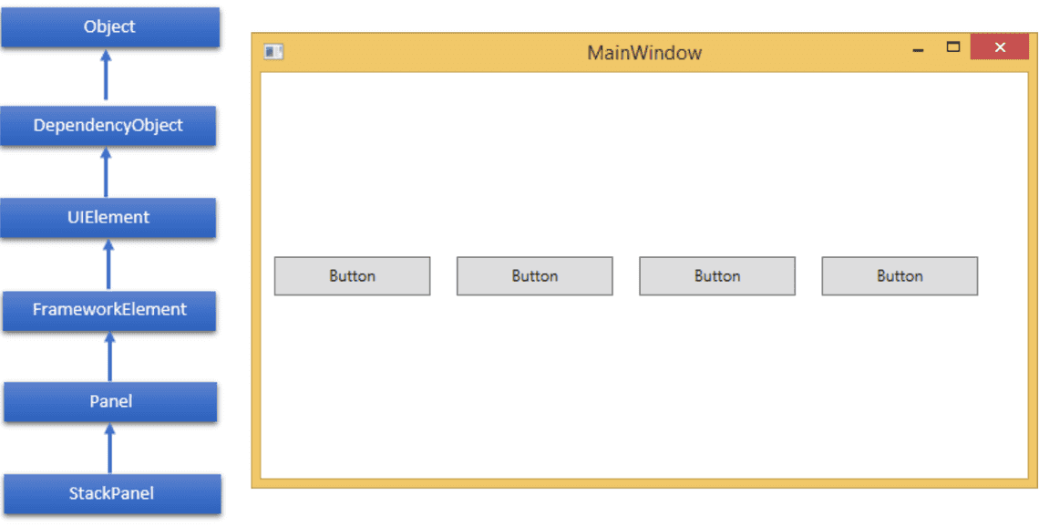
Stack panel is a simple and useful layout panel in XAML.In stack panel,child elements
can be arranged in asingle line,either horizontally or vertically,based on the orientation
property. It is often used whenever any kind of list is to be created.
The hierarchical inheritance of StackPanel class is as follows:
| Property | Description |
|---|---|
| Background | Gets or sets a Brush that fills the panel content area. (Inherited from Panel) |
| Children | Gets a UIElementCollection of child elements of this Panel. (Inherited from Panel.) |
| Height | Gets or sets the suggestedheight of the element. (Inherited from FrameworkElement.) |
| ItemHeight | Gets or sets a value that specifies the height of all items that are contained within a WrapPanel |
| ItemWidth | Gets or sets a value that specifies the width of all items that arecontained within a WrapPanel |
| LogicalChildren | Gets an enumerator that can iterate the logical child elements of this Panel element. (Inherited from Panel.) |
| LogicalOrientation | The Orientation of the panel, if the panel supports layout in only a single dimension. (Inherited from Panel.) |
| Margin | Gets or sets the outer margin of an element. (Inherited from FrameworkElement.) |
| Name | Gets or sets the identifying name of the element. The name provides a reference so that code-behind, |
| Orientation | Gets or sets a value that specifies the dimension in which child content is arranged |
| Parent | Gets the logical parent element of this element. (Inherited from FrameworkElement.) |
| Resources | Gets or sets the locally-defined resource dictionary. (Inherited from FrameworkElement.) |
| Style | Gets or sets the style used by this element when it is rendered. (Inherited from FrameworkElement.) |
| Width | Gets or sets the width of the element. (Inherited from FrameworkElement.) |
<Window x:Class="FirstProject.MainWindow"xmlns="http://schemas.microsoft.com/winfx/2006/xaml/presentation"xmlns:x="http://schemas.microsoft.com/winfx/2006/xaml"xmlns:d="http://schemas.microsoft.com/expression/blend/2008"xmlns:mc="http://schemas.openxmlformats.org/markup-compatibility/2006"xmlns:local="clr-namespace:FirstProject.Components"mc:Ignorable="d"Title="MainWindow" Height="450" Width="800"><Grid><Grid><StackPanel Orientation="Vertical"><Button x:Name="button" Content="Button" Margin="10" Width="120" Height="30"/><Button x:Name="button1" Content="Button" Margin="10" Width="120" Height="30"/><Button x:Name="button2" Content="Button" Margin="10" Width="120" Height="30"/><Button x:Name="button3" Content="Button" Margin="10" Width="120" Height="30"/></StackPanel></Grid></Grid></Window>
Wrap Panel
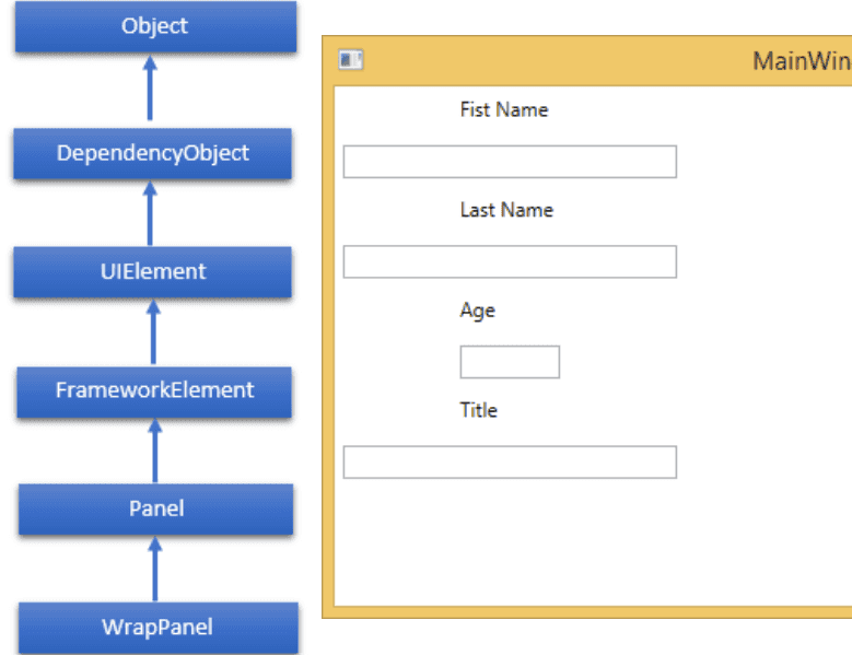
WrapPanel is mostly used for tabs or menu items. The hierarchical inheritance of WrapPanel class is as follows:
| Property | Description |
|---|---|
| Background | Gets or sets a Brush that fills the panel content area. (Inherited from Panel) |
| Children | Gets a UIElementCollection of child elements of this Panel. (Inherited from Panel.) |
| Height | Gets or sets the suggestedheight of the element. (Inherited from FrameworkElement.) |
| ItemHeight | Gets or sets a value that specifies the height of all items that are contained within a WrapPanel |
| ItemWidth | Gets or sets a value that specifies the width of all items that arecontained within a WrapPanel |
| LogicalChildren | Gets an enumerator that can iterate the logical child elements of this Panel element. (Inherited from Panel.) |
| LogicalOrientation | The Orientation of the panel, if the panel supports layout in only a single dimension. (Inherited from Panel.) |
| Margin | Gets or sets the outer margin of an element. (Inherited from FrameworkElement.) |
| Name | Gets or sets the identifying name of the element. The name provides a reference so that code-behind, |
| Orientation | Gets or sets a value that specifies the dimension in which child content is arranged |
| Parent | Gets the logical parent element of this element. (Inherited from FrameworkElement.) |
| Resources | Gets or sets the locally-defined resource dictionary. (Inherited from FrameworkElement.) |
| Style | Gets or sets the style used by this element when it is rendered. (Inherited from FrameworkElement.) |
| Width | Gets or sets the width of the element. (Inherited from FrameworkElement.) |
<Window x:Class="FirstProject.MainWindow"xmlns="http://schemas.microsoft.com/winfx/2006/xaml/presentation"xmlns:x="http://schemas.microsoft.com/winfx/2006/xaml"xmlns:d="http://schemas.microsoft.com/expression/blend/2008"xmlns:mc="http://schemas.openxmlformats.org/markup-compatibility/2006"xmlns:local="clr-namespace:FirstProject.Components"mc:Ignorable="d"Title="MainWindow" Height="450" Width="800"><Grid><WrapPanel Orientation="Vertical"><TextBlock Text="Fist Name" Width="60" Height="20" Margin="5"/><TextBox Width="200" Height="20" Margin="5"/><TextBlock Text="Last Name" Width="60" Height="20" Margin="5"/><TextBox Width="200" Height="20" Margin="5"/><TextBlock Text="Age" Width="60" Height="20" Margin="5"/><TextBox Width="60" Height="20" Margin="5"/><TextBlock Text="Title" Width="60" Height="20" Margin="5"/><TextBox Width="200" Height="20" Margin="5"/></WrapPanel></Grid></Window>
Dock Panel
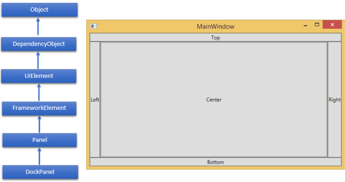
DockPanel defines an area to arrange child elements relative to each other,
either horizontally or vertically. With DockPanel you can easily dock child
elements to top, bottom, right, left and center using sthe Dock property
With Last Child Fill property,the last child element fill the remaining space regardless of any other dock value when set for that element.
| Property | Description |
|---|---|
| Background | Gets or sets a Brush that fills the panel content area. (Inherited from Panel) |
| Children | Gets a UIElementCollection of child elements of this Panel. (Inherited from Panel.) |
| Dock | Gets or sets a value that indicates the position of a childelement within a parent DockPanel. |
| Height | Gets or sets the suggestedheight of the element. (Inherited from FrameworkElement.) |
| ItemHeight | Gets or sets a value that specifies the height of all items that are contained within a WrapPanel |
| ItemWidth | Gets or sets a value that specifies the width of all items that arecontained within a WrapPanel |
| LastChildFill | Gets or sets a value that indicates whether the last child element within a DockPanel stretches to fill the remaining available space |
| LogicalChildren | Gets an enumerator that can iterate the logical child elements of this Panel element. (Inherited from Panel.) |
| LogicalOrientation | The Orientation of the panel, if the panel supports layout in only a single dimension. (Inherited from Panel.) |
| Margin | Gets or sets the outer margin of an element. (Inherited from FrameworkElement.) |
| Name | Gets or sets the identifying name of the element. The name provides a reference so that code-behind, |
| Orientation | Gets or sets a value that specifies the dimension in which child content is arranged |
| Parent | Gets the logical parent element of this element. (Inherited from FrameworkElement.) |
| Resources | Gets or sets the locally-defined resource dictionary. (Inherited from FrameworkElement.) |
| Style | Gets or sets the style used by this element when it is rendered. (Inherited from FrameworkElement.) |
| Width | Gets or sets the width of the element. (Inherited from FrameworkElement.) |
<Window x:Class="FirstProject.MainWindow"xmlns="http://schemas.microsoft.com/winfx/2006/xaml/presentation"xmlns:x="http://schemas.microsoft.com/winfx/2006/xaml"xmlns:d="http://schemas.microsoft.com/expression/blend/2008"xmlns:mc="http://schemas.openxmlformats.org/markup-compatibility/2006"xmlns:local="clr-namespace:FirstProject.Components"mc:Ignorable="d"Title="MainWindow" Height="450" Width="800"><Grid><DockPanel LastChildFill="True"><Button Content="Top" DockPanel.Dock="Top" Click="Click_Me"/><Button Content="Bottom" DockPanel.Dock="Bottom" Click="Click_Me"/><Button Content="Left" Click="Click_Me"/><Button Content="Right" DockPanel.Dock="Right" Click="Click_Me"/><Button Content="Center" Click="Click_Me"/></DockPanel></Grid></Window>
private void Click_Me(object sender, RoutedEventArgs e) {Button btn = sender as Button;string str = btn.Content.ToString() + " button clicked"; MessageBox.Show(str);}
Canvas Panel
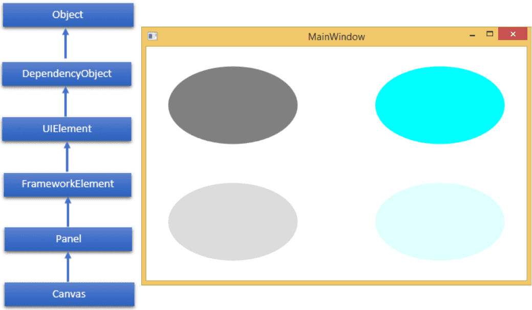
Canvas panel is the basic layout panelin which the child elements can be positioned explicitly using coordinates that are relative to the Canvasany sidesuch as left, right, top and bottom.
| Property | Description |
|---|---|
| Background | Gets or sets a Brush that fills the panel content area. (Inherited from Panel) |
| Children | Gets a UIElementCollection of child elements of this Panel. (Inherited from Panel.) |
| Height | Gets or sets the suggestedheight of the element. (Inherited from FrameworkElement.) |
| ItemHeight | Gets or sets a value that specifies the height of all items that are contained within a WrapPanel |
| ItemWidth | Gets or sets a value that specifies the width of all items that arecontained within a WrapPanel |
| LogicalChildren | Gets an enumerator that can iterate the logical child elements of this Panel element. (Inherited from Panel.) |
| LogicalOrientation | The Orientation of the panel, if the panel supports layout in only a single dimension. (Inherited from Panel.) |
| LeftProperty | dentifies the Canvas.LeftXAML attached property |
| Margin | Gets or sets the outer margin of an element. (Inherited from FrameworkElement.) |
| Name | Gets or sets the identifying name of the element. The name provides a reference so that code-behind, |
| Orientation | Gets or sets a value that specifies the dimension in which child content is arranged |
| Parent | Gets the logical parent element of this element. (Inherited from FrameworkElement.) |
| Resources | Gets or sets the locally-defined resource dictionary. (Inherited from FrameworkElement.) |
| Style | Gets or sets the style used by this element when it is rendered. (Inherited from FrameworkElement.) |
| TopProperty | Identifies the Canvas.TopXAML attached property |
| Width | Gets or sets the width of the element. (Inherited from FrameworkElement.) |
| ZIndexProperty | Identifies the Canvas.ZIndexXAML attached property |
| Property | Description |
|---|---|
| GetLeft | Gets the value of the Canvas.LeftXAML attached property for the target element |
| GetTop | Gets the value of the Canvas.TopXAML attached property for the target element |
| GetZIndex | Gets the value of the Canvas.ZIndexXAML attached property for the target element |
| SetLeft | Gets or sets a Brush that fills the panel content area. (Inherited from Panel) |
| SetTop | Sets the value of the Canvas.TopXAML attached property for a target element |
| SetZIndex | Sets the value of the Canvas.ZIndexXAML attached property for a target element |
<Window x:Class="FirstProject.MainWindow"xmlns="http://schemas.microsoft.com/winfx/2006/xaml/presentation"xmlns:x="http://schemas.microsoft.com/winfx/2006/xaml"xmlns:d="http://schemas.microsoft.com/expression/blend/2008"xmlns:mc="http://schemas.openxmlformats.org/markup-compatibility/2006"xmlns:local="clr-namespace:FirstProject.Components"mc:Ignorable="d"Title="MainWindow" Height="450" Width="800"><Grid><Canvas Width="580" Height="360" ><Ellipse Canvas.Left="30" Canvas.Top="30" Fill="Gray" Width="200" Height="120" /><Ellipse Canvas.Right="30" Canvas.Top="30" Fill="Aqua" Width="200" Height="120" /><Ellipse Canvas.Left="30" Canvas.Bottom="30" Fill="Gainsboro" Width="200" Height="120" /><Ellipse Canvas.Right="30" Canvas.Bottom="30" Fill="LightCyan" Width="200" Height="120"/></Canvas></Grid></Window>
Grid Panel
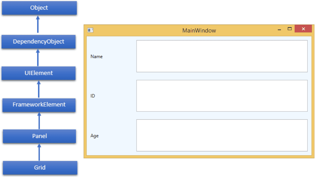
A Grid Panel provides a flexible area which consists of rows and columns. By default, a Grid panel is created with one row and one column. Multiple rows and columns are created by Row Definitions and Column Definitions properties. The height of rows and the width of columns can be defined in the following three ways
- Fixed value:To assign a fixed size of logical units (1/96 inch)
- Auto:It will take space which are required for the controls in that specific row/column.
- Star (*):It will take the remaining space when Auto and fixed sized are filled
| Property | Description |
|---|---|
| Background | Gets or sets a Brush that fills the panel content area. (Inherited from Panel) |
| Children | Gets a UIElementCollection of child elements of this Panel. (Inherited from Panel.) |
| ColumnDefinitions | Gets a list of ColumnDefinition objects defined on this instance of Grid |
| Height | Gets or sets the suggestedheight of the element. (Inherited from FrameworkElement.) |
| ItemHeight | Gets or sets a value that specifies the height of all items that are contained within a WrapPanel |
| ItemWidth | Gets or sets a value that specifies the width of all items that arecontained within a WrapPanel |
| Margin | Gets or sets the outer margin of an element. (Inherited from FrameworkElement.) |
| Name | Gets or sets the identifying name of the element. The name provides a reference so that code-behind, |
| Orientation | Gets or sets a value that specifies the dimension in which child content is arranged |
| Parent | Gets the logical parent element of this element. (Inherited from FrameworkElement.) |
| Resources | Gets or sets the locally-defined resource dictionary. (Inherited from FrameworkElement.) |
| RowDefinitions | Gets a list of RowDefinition objects defined on this instance of Grid |
| Style | Gets or sets the style used by this element when it is rendered. (Inherited from FrameworkElement.) |
| TopProperty | Identifies the Canvas.TopXAML attached property |
| Width | Gets or sets the width of the element. (Inherited from FrameworkElement.) |
| Property | Description |
|---|---|
| GetColumn | Gets the value of the Grid.Column XAML attached property from the specified FrameworkElement |
| GetColumnSpan | Gets the value of the Grid.ColumnSpan XAML attached property from the specified FrameworkElement |
| GetRow | Gets the value of the Grid.Row XAML attached property from the specifiedFrameworkElement |
| SetColumn | Sets the value of the Grid.Column XAML attached property on the specified FrameworkElement |
| SetRow | Sets the value of the Grid.Row XAML attached property on the specified FrameworkElement |
| SetRowSpan | Sets the value of the Grid.RowSpan XAML attached property on the specified FrameworkElement |
<Window x:Class="FirstProject.MainWindow"xmlns="http://schemas.microsoft.com/winfx/2006/xaml/presentation"xmlns:x="http://schemas.microsoft.com/winfx/2006/xaml"xmlns:d="http://schemas.microsoft.com/expression/blend/2008"xmlns:mc="http://schemas.openxmlformats.org/markup-compatibility/2006"xmlns:local="clr-namespace:FirstProject.Components"mc:Ignorable="d"Title="MainWindow" Height="450" Width="800"><Grid><Grid x:Name="FormLayoutGrid" Background="AliceBlue"><Grid.ColumnDefinitions><ColumnDefinition Width="Auto" /><ColumnDefinition /></Grid.ColumnDefinitions><Grid.RowDefinitions><RowDefinition Height="*" /><RowDefinition Height="*" /><RowDefinition Height="*" /></Grid.RowDefinitions><TextBlock Grid.Row="0" Grid.Column="0" Text="Name" Margin="10" HorizontalAlignment="Left" VerticalAlignment="Center" Width="100"/><TextBox Grid.Row="0" Grid.Column="1" Margin="10" /><TextBlock Grid.Row="1" Grid.Column="0" Text="ID" Margin="10" HorizontalAlignment="Left" VerticalAlignment="Center" Width="100"/><TextBox Grid.Row="1" Grid.Column="1" Margin="10" /><TextBlock Grid.Row="2" Grid.Column="0" Text="Age" Margin="10" HorizontalAlignment="Left" VerticalAlignment="Center" Width="100"/><TextBox Grid.Row="2" Grid.Column="1" Margin="10" /></Grid></Grid></Window>
Tags
Share
Table Of Contents
Related Posts
Quick Links
Legal Stuff
Social Media
